Role:Developer, Designer
Agency:Creative Pursuits
Year:2012
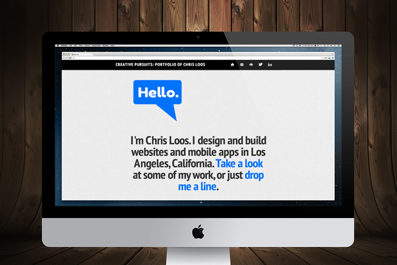
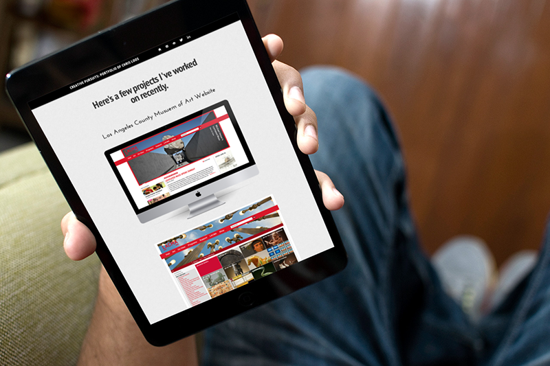
Personal portfolio websites are a great place to experiment with new design elements that you haven't gotten to use on client websites. The previous incarnation of my personal portfolio website was no exception to this. Rather than using a navigation bar with items that open new pages or modal dialogs when clicked, I decided to include all content on a single, long homepage. Clicking items in the nav bar would trigger an animation, scrolling down the page to the desired content.
I found that there were both positives and negatives to this approach. The scrolling animation gave the site a fun, interactive quality. On the other hand, as the homepage grew longer as additional content was added, the more the homepage became unwieldy. The scrolling animation to sections near the bottom became an annoyance, and the large amount of images on a single page negatively affected page loading time, and required the use of additional plugins to mitigate the issue and load images on an as-needed basis.
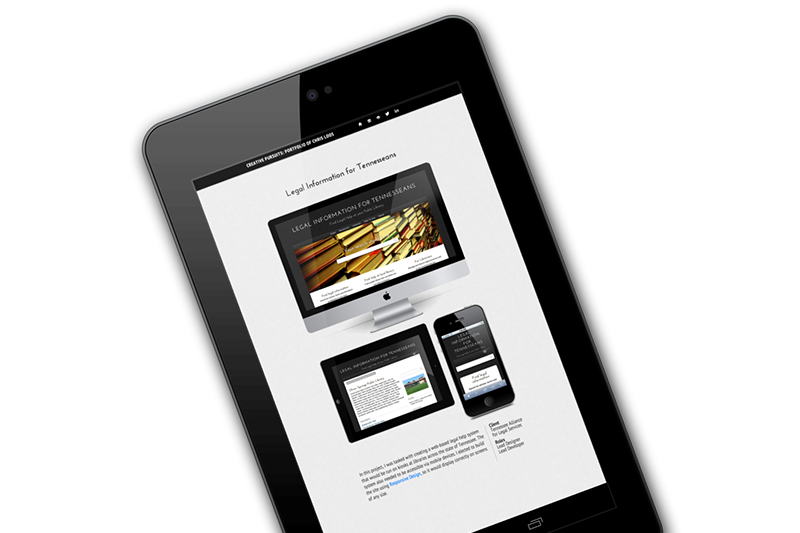
I built the site in early 2012 not long after I decided that every site I would build from that point on would be responsive and mobile-friendly. So naturally, I featured some of my resposive design work, and of course made the portfolio site itself responsive.


